
Most mission-driven organizations put more work into their impact than their website — so the site ends up looking like every other "give back" brand: a badge in the footer, a stock photo of a forest, a mission statement nobody reads.
If the design doesn't reflect the standard you actually meet, visitors have no way to tell you apart from a company that's just claiming to.
Design that proves the mission instead of decorating it
Certifications and impact reports only work if people actually absorb them. I turn your standards, your story, and your numbers into a visual system that makes the mission legible at a glance — not just another badge in the footer.
Donation and inquiry flows built around trust, not friction
People give and apply to organizations they believe, fast, before they second-guess it. I design the path from "I care about this" to "I did something about it" so it's short, clear, and free of anything that makes someone hesitate.
A site you can grow as the mission grows
Your impact report changes every year. Your programs shift. I set the site up so you can update numbers, add case studies, or launch a new initiative yourself — in minutes, without waiting on anyone.
Michal is a terrific designer/dev combo. He works hard and fast, is perhaps the most communicative external team member I've ever worked with, and was a huge help when needs and challenges arose unexpectedly.
Michal brings a thoughtful approach to design, he takes the time to understand your thinking on design, the borders of it and where you want it to go. This has time and time again, produced great work.
Projects that made the decision easier for their customers
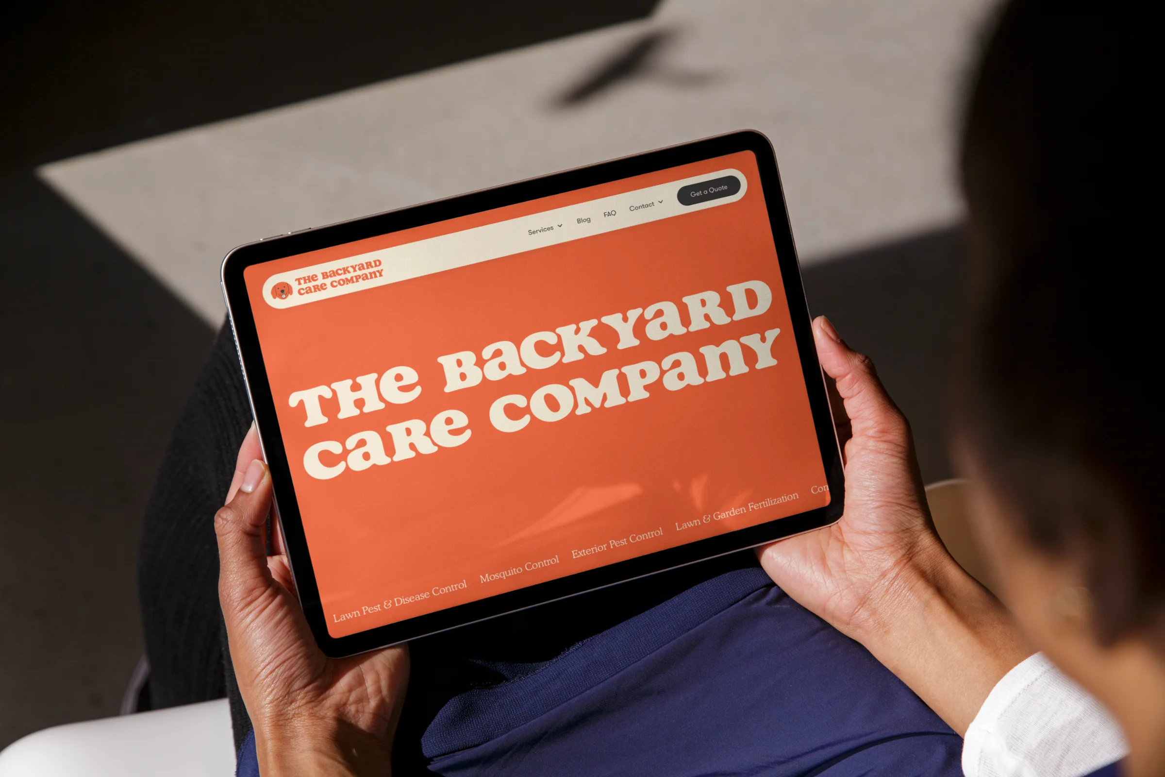
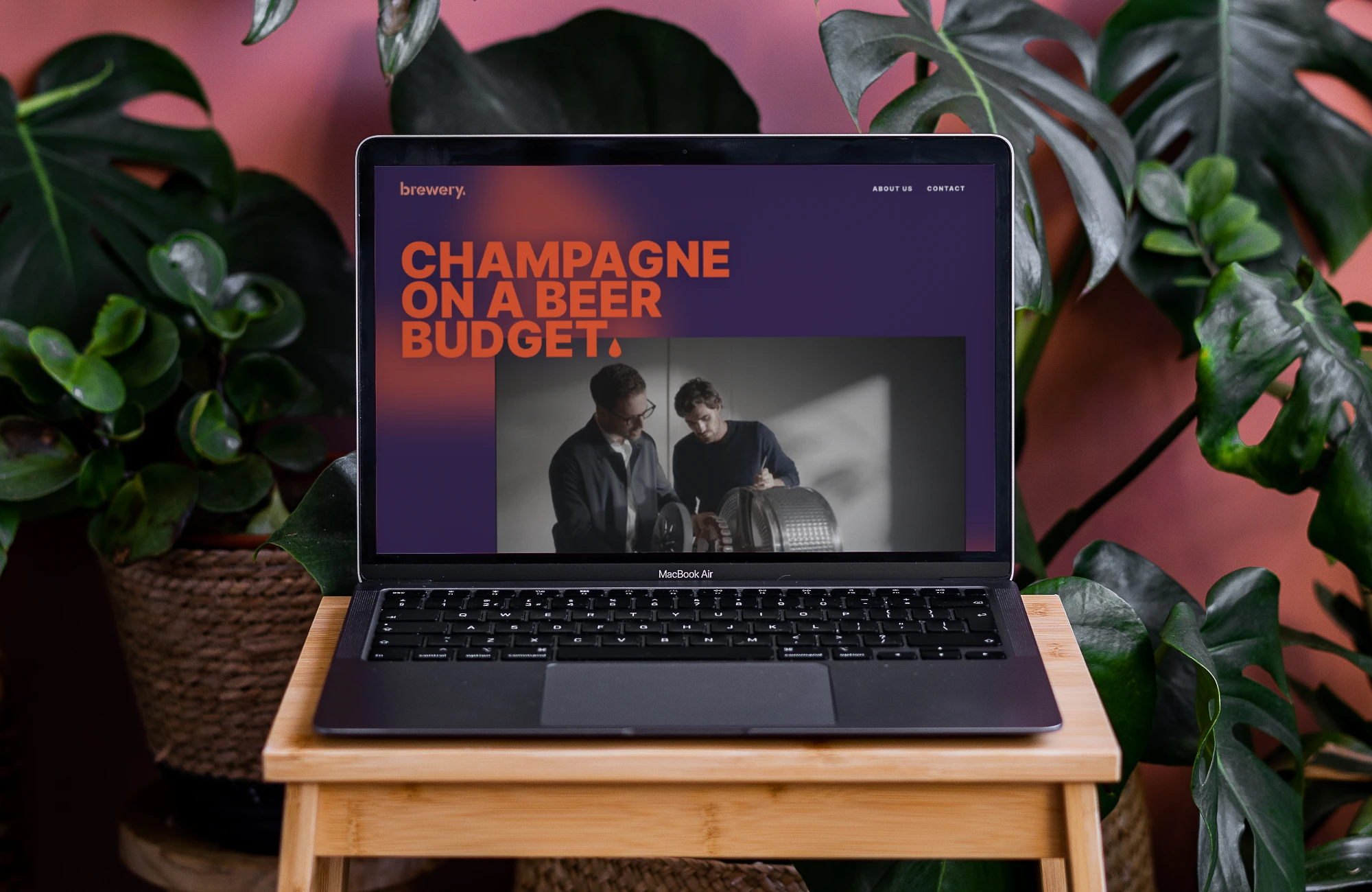
Every project moves through the same four stages — not because one process fits every client, but because skipping a step is exactly where good ideas turn generic. Here's how we get from your first idea to a live site.
Step 1 — Brainstorm
We start loose, no wireframes yet. Just a conversation about the change you’re making, who needs to hear it, and what a visitor should feel in the first five seconds. This is where your story and direction get set.
Step 2 — Experience
Loose ideas become structure. I map the pages, the flows, and the moments that matter most: donating, volunteering, partnering, joining. The site works before it looks like anything.
Step 3 — Visual
Structure becomes a real interface: type, color, imagery, motion. Your values show up in every choice, built in Webflow so your team can launch confidently and maintain it on a nonprofit budget.
Step 4 — Build
The design becomes a working site with a CMS your team can actually use for stories, impact reports, events, and campaigns. Tested across devices, accessible, and ready to launch without surprises.
Tell me what you're working on and what you need. I'll get back to you within a day or two.
